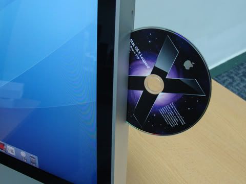
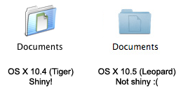
The rest of the day was spent waiting for the updates to download. While waiting I tried to get used to the new UI, and to figure out what's changed. Overall, it looks shinier than Tiger, but the new folder icons are dreadful. They have this dim look to them that makes you think they're not really an active part of the user interface, which is a terrible UI design choice.
Also, the new firewall befuddles me. It has three settings:
- Allow all incoming connections
- Allow only essential services
- Set access for specific services and applications
Apart from those issues, I think I like the new changes to the UI. The new dock is very pretty, as is the "stacking effect" when multiple documents spring up from a single dock slot. Spaces (multiple virtual desktops) are a welcome addition to the UI, as Mac OS X boldly takes users to where Unix desktops have been since the 1980's. The Quick Look feature is kind of neat (in a flashy way), as it lets you preview the contents of any particular file. I haven't taken a look at Time Machine (a file snapshot and archiving tool) yet, but it may come in handy for some of the things I need to do at work.


No comments:
Post a Comment